

Using the Dashboard
If your Ayrshare account is entitled to manage multiple profiles, then you will see the option for User Profiles in the left-hand navigation.If your account does not have the option to manage profiles, then contact your Ayrshare
representative or contact us to upgrade.
Create a New Profile
Click the Add Profile button and enter your User Profile Title.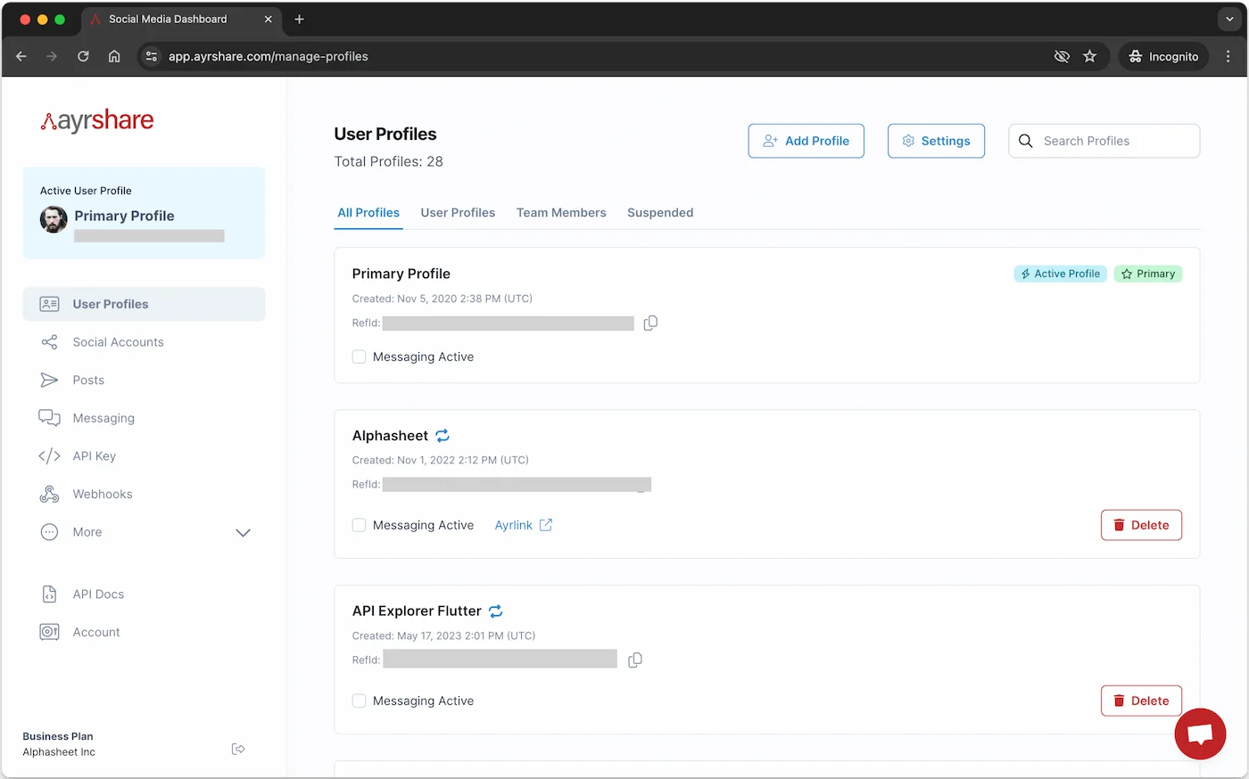
Switch to the New Profile
You will see the new Profile show up in the Active Profiles section. You can now click on the switch to this profile icon to switch to that User Profile.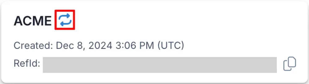
Get the Profile Key
The Profile Key is used to post on behalf of the profile with the API. Switch to a User Profile and go to the Profile Key page in the left-hand navigation of the Dashboard to get that profile’s Key. When making an API call, be sure to include your API_KEY and PROFILE_KEY in the header. You also receive the Profile Key when you create a new User Profile using the /profiles/profile endpoint. This is the preferred method to get the Profile Key.Invite a Team Member
You can create Users Profiles for members of your team. By default, Team Members have an Ayrshare account with full access/admin rights to the dashboard and count as a new User Profile. Please note, you may restrict access by locking the Primary Profile. In the User Profiles page, switch to your Primary Profile and click the + Add Profile button at the top of the page. In the pop-up modal, click the checkbox “Create a team member profiles with admin rights” box and enter your team member’s email address.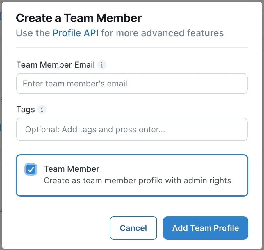
Team Member Status
Once the team member has accepted the invite you will see a green check mark next to the Team Member tag.
Team Members Contacting Support
Reactivate a Suspended User Profile
Suspension Reason
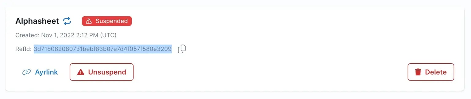
When a User Profile gets suspended due to a social network violation (such as a Facebook community standards violation), you will receive a detailed notification email. This email contains important information about the suspension, including the specific reason and the affected User Profile. To locate this notification email:- Search your inbox using the RefId of the suspended User Profile
- The email subject will clearly indicate a suspension has occurred
Reactivate a Suspended User Profile
You may reactivate, i.e. unsuspend, the User Profile by:- Logging into the Dashboard and going to the User Profiles page.
- Find the suspended User Profiles by clicking the “Suspended” tab or searching by the RefId of the User Profile, which is included in the email.
- Unsuspend the User Profile by clicking the “Unsuspended” button.
- Review and accept the compliance certification.
Managing Active User Profiles
Effective management of User Profiles is essential for maintaining an efficient system in Ayrshare. We recommend implementing a policy to remove inactive User Profiles based on your business requirements. For example, if a user hasn’t engaged with your platform by posting content, requesting analytics for some time period, or has not connected any social networks, consider deleting their Ayrshare User Profile, thus keeping your user base current and reducing future costs. You can check if a User Profile has been active in the current month by reviewing their posting history and API usage and connections. If you determined it to be inactive, delete the User Profile. Each monthly billing period is charged on the highest number of User Profiles reached on any single day of that period, and never on fewer than the minimum included in your plan — deleting User Profiles while you are at that minimum does not lower the charge. That high-water mark only ever rises: deleting a User Profile stops later days from pushing it higher, but it cannot bring down a figure the period has already reached, so once your peak is behind you the saving lands in your next billing cycle. This does not apply to the Launch plan, which has a flat price, or to custom and Enterprise agreements, whose own terms apply. Remove inactive User Profiles as soon as you identify them rather than waiting for the period to end. You can see your daily User Profile counts with Get User Profiles andactionLog set to true.
White-Label the Connect Accounts Page
The connect accounts (social linking) page is the only Ayrshare interface your customers ever see, so you can white-label it to match your brand. Settings below are configured once by your team from the Primary Profile and apply to the page your users open via the JWT URL. Available on the Launch, Business, and Enterprise plans:- Add or remove your company logo and set its height.
- Choose which social networks your users can connect.
- Set the page language.
- Show your own help links or hide Ayrshare’s.
- Set the top and sub headers per User Profile (e.g. the client’s name or business).
- Control the Close button redirect back to your app.
- Customize the Instagram and Telegram modals with your own HTML.
- Apply a custom CSS file to control colors, fonts, and which features show, using documented class hooks to restyle the connect buttons themselves.
- Color the linking dialogs — page pickers, credential forms, and confirmations — to match your page.
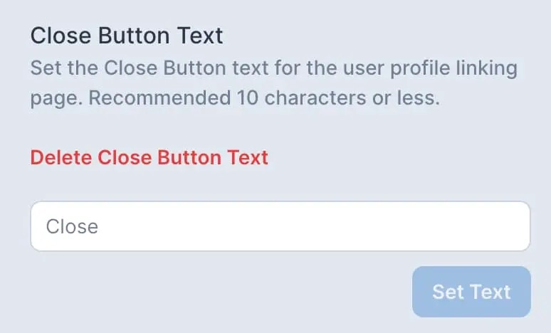
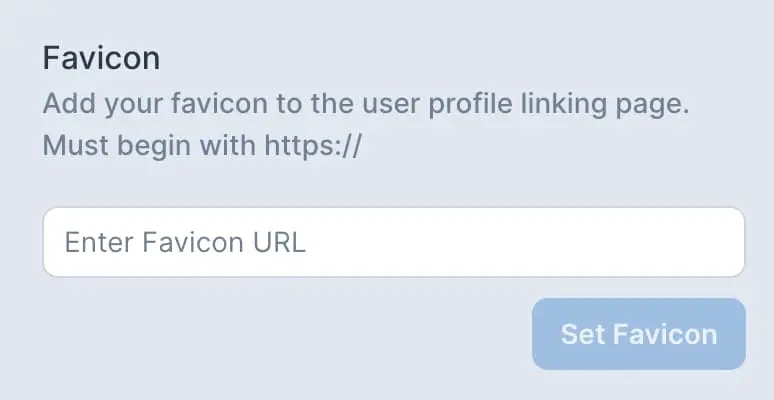
- Set your own page title, Close button text, and favicon.
- Add custom footer text or HTML.
Settings
In the User Profiles page select “⚙️ Settings” button to access global settings for your profiles. Be sure to first switch to your Primary Profile to access the settings.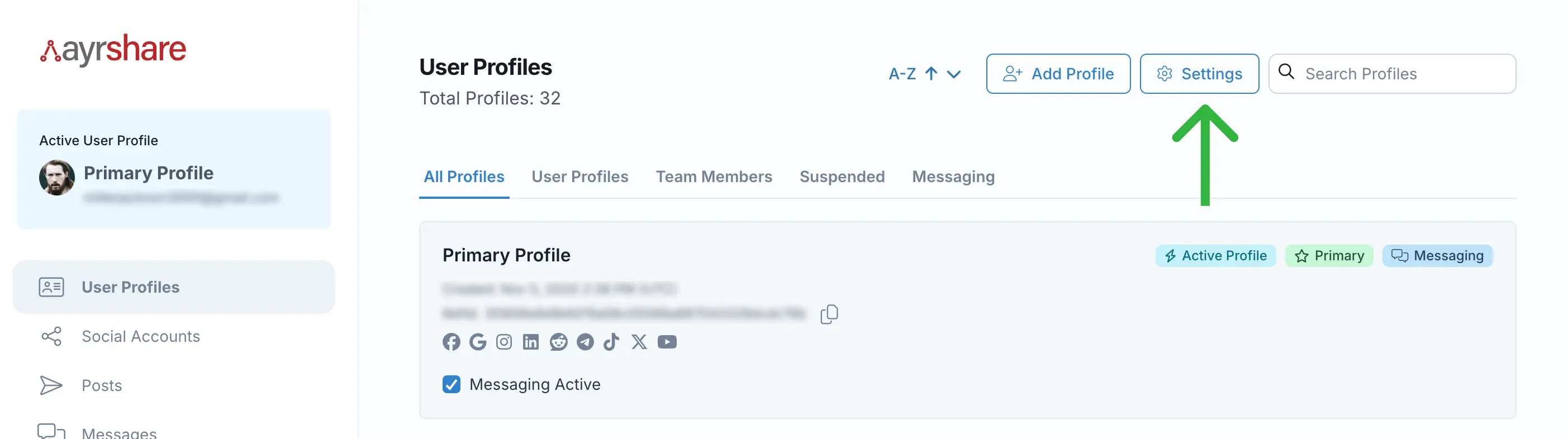
Video Demo of Linking Page Customization Options
Restrict User Profile Access
Restrict Primary Profile Access
Restrict access to the Primary Profile from user and team member profiles by locking the Primary Profile. Activate the Primary Profile lock if you want to prevent team members or user profiles from accessing Profile Settings or the Account/Billing page.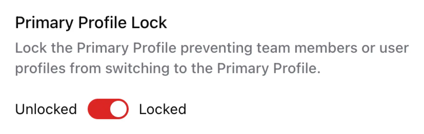
Restrict Team Member Access
Restrict access to team member profiles by locking their account. This prevents the team member from switching to any other User Profile. Enable the lock by clicking the or icon in the top right of a team member profile.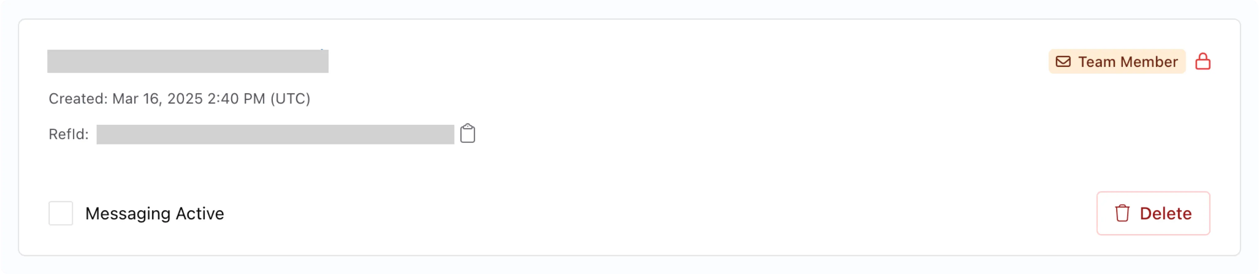
Update Logo on Social Linking Page
Add your own logo and set the logo height for the social linking page.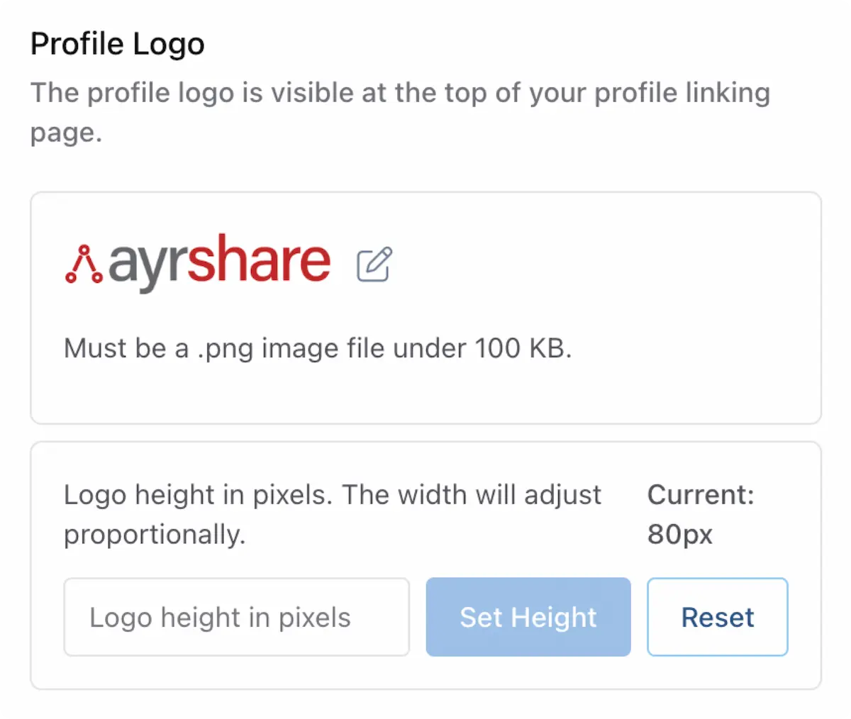
hideLogo parameter on Create Profile and Update Profile. The account-wide logo on every other profile is unaffected. This is useful when an agency white-labels one partner while keeping branding on the rest of their profiles.
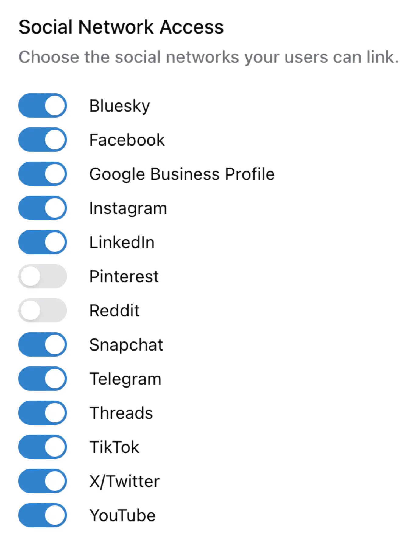
Set Social Networks Access
Remove or grant your users/profiles access to the available social networks. By default all social networks are active and available.Permissions are global across all your user profiles. Disabling only removes the network from your
user’s Social Accounts view and does not remove established links.
Set Language for Social Linking
Set the language for the social linking page. English is the default.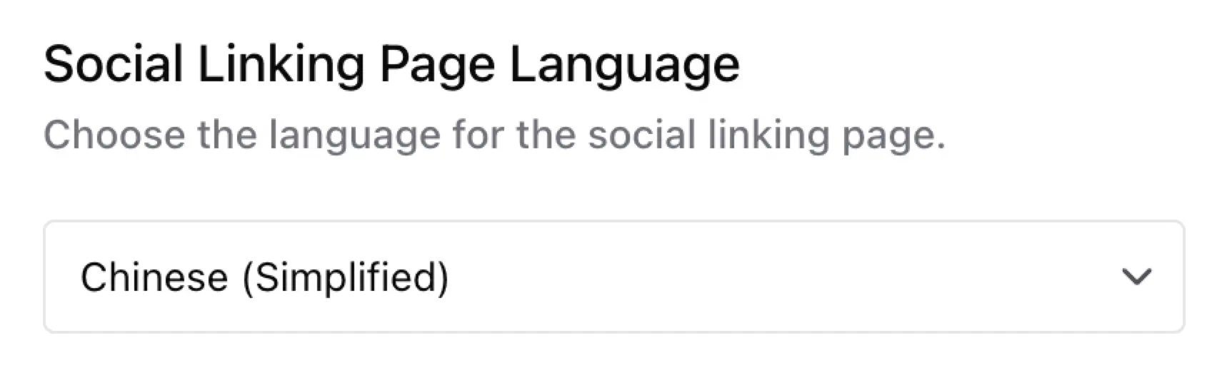
- English
- Arabic
- Chinese (Simplified)
- French
- German
- Italian
- Japanese
- Portuguese
- Spanish
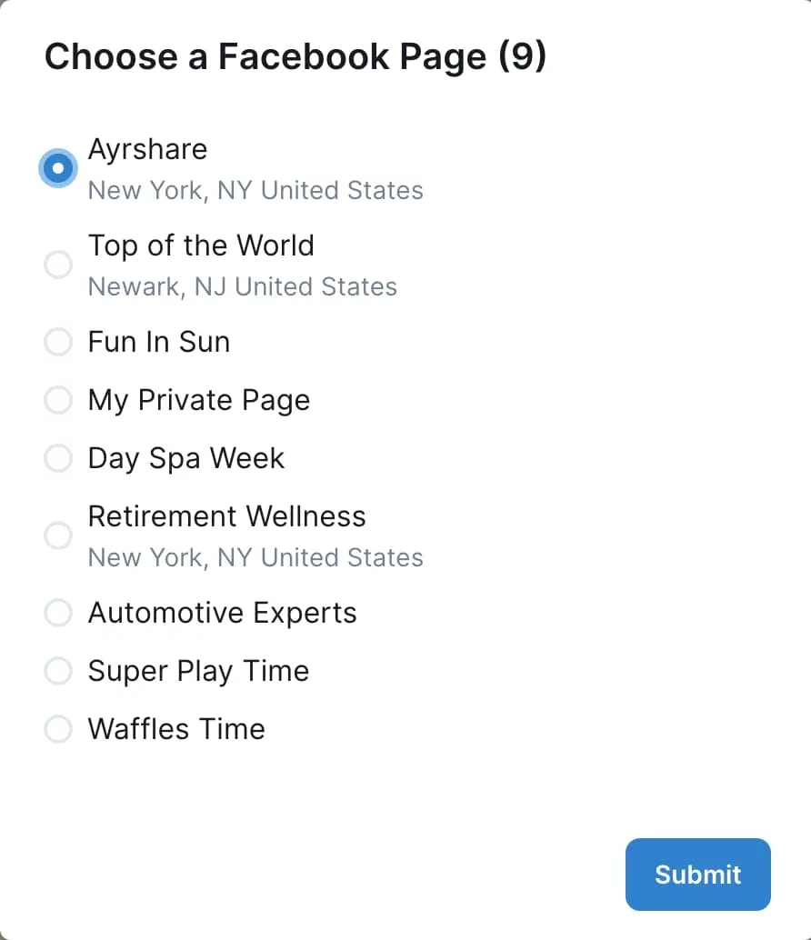
Display Page Location
On the social linking page, if a Meta (Facebook or Instagram) or Google Business Profile Page has a location associated with it, display that location information along with the Page name. This additional location context is helpful in scenarios where there are multiple Pages with identical names, as it allows users to differentiate between them more easily.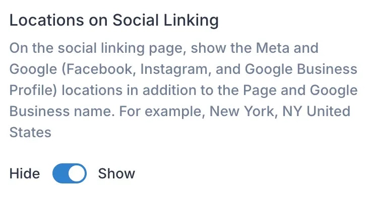
Help Links Visible
Enable or disable visibility of the links to the Ayrshare help docs on your users’ social linking page. You can also use your own by entering a URL to your publicly available docs.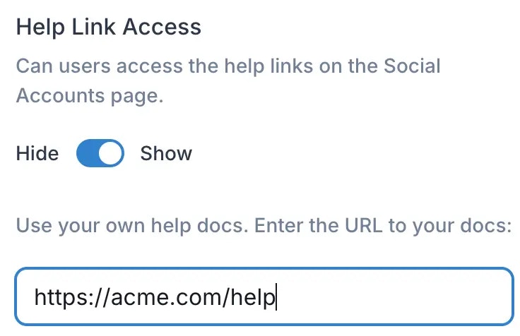
Alternative Emails for Alerts
Choose different email addresses to deliver alerts, such as unlinked accounts.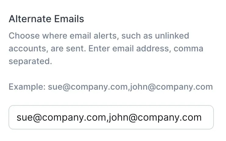
Instagram Login
Enable or disable Instagram login on the social linking page.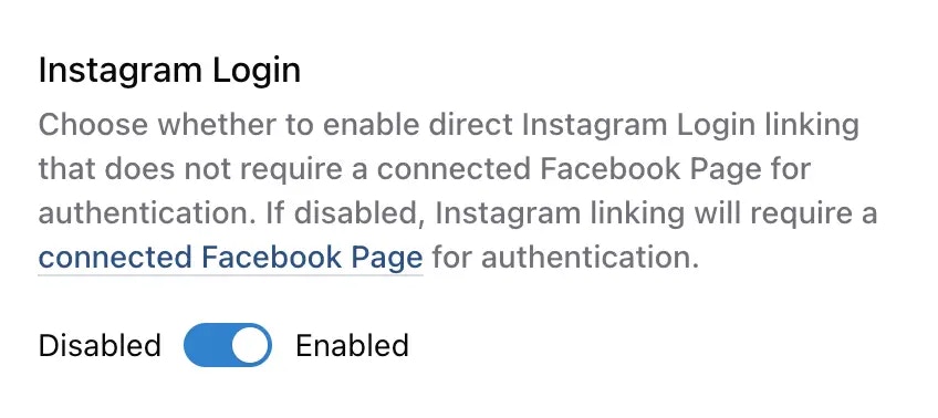
Direct Instagram Login vs Facebook Page Authentication
Direct Instagram Login Instagram API with Instagram Login allows Instagram professionals (businesses and creators) to link their accounts directly without needing an associated Facebook Page. This provides a simplified authentication flow. Facebook Page Authentication (traditional method) requires users to first connect a Facebook Page that is linked to their Instagram professional account.Feature Limitations with Direct Instagram Login
While direct Instagram Login offers convenience, certain features are not available when using this method:- Brand/User Data - Cannot retrieve Instagram account information through the brand endpoints.
- Hashtag Search - Cannot search for hashtags on Instagram.
- Collaborations - Cannot invite collaborators to Instagram posts.
- Location Tagging - Cannot add location tags to Instagram posts.
idId- Legacy Instagram User ID - field not returned for Instagram social analytics.
Which Method Should You Choose?
- Enable Direct Instagram Login if you only need basic posting functionality and don’t require the advanced features listed above.
- Disable Direct Instagram Login (use Facebook Page authentication) if you need access to all Instagram features, including hashtag search, collaborations, location tagging, or brand data retrieval.
For most clients, the preferred method is to use the direct Instagram Login authentication. If
you’re unsure which method to use, we recommend disabling Direct Instagram Login to ensure access
to all features. You can always enable it later if you determine the advanced features are not
needed.
Custom Modals
You can customize the content shown in the Instagram and Telegram modals on the social linking page with your own custom HTML content, such as displaying the content in different languages. For Telegram, your content replaces the modal’s default instructions. For Instagram, the modal only appears when you provide custom content — otherwise, clicking Instagram goes straight to the configured login flow: Instagram’s own login or, if you have disabled Instagram Login, a Facebook login. Your custom content can include formatted text, images, or a combination of both to better suit your needs.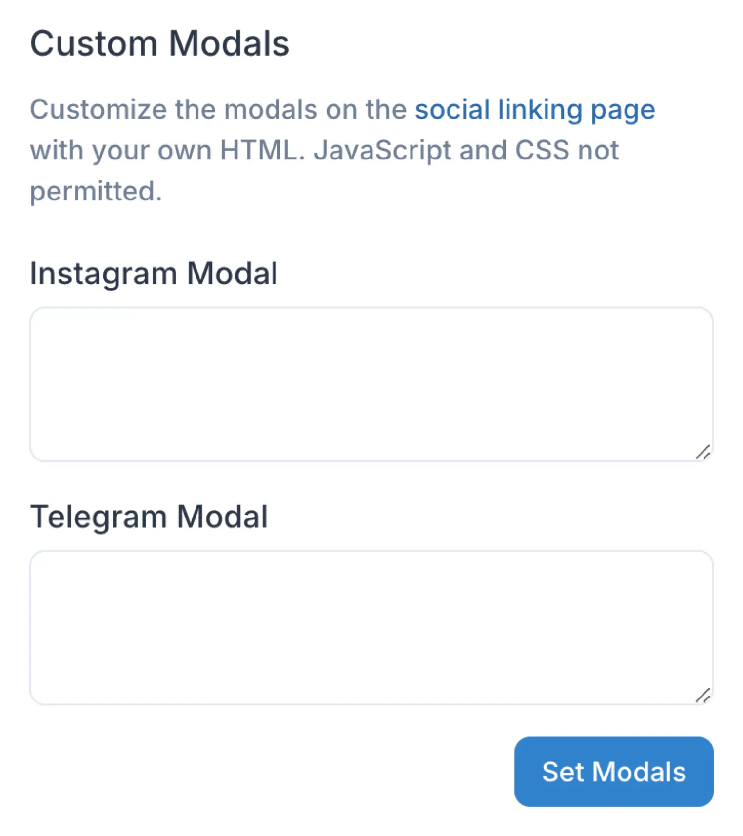
Custom HTML Modal
Your Custom CSS file
The HTML must be enclosed in
<div> tags.Style it with class names and put the rules in your custom CSS file. <style>
blocks and style attributes inside the modal HTML are removed before the modal is displayed,
so styling has to come from your CSS file. <script> tags and <link> tags are removed too.Using the API
Create and Manage Profiles
You can create, delete, and manage your profiles via the API using the /profiles endpoints. Please see below for details.Profile
Get the Profile Key
The Profile Key is returned when you create a new profile via the API using the /profile endpoint. If you need to get the profile key again, go to the Dashboard to retrieve. See above.Enable Messaging
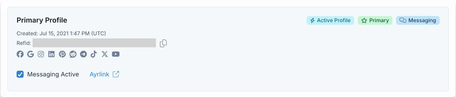
Messages
Max Pack Customization
In the Ayrshare Dashboard page User Profile -> Setting, you can customize aspects of the social linking page. Please see the Max Pack for details on the capabilities and features.Customize CSS
Use your own CSS file to customize the look and feel of the social accounts page: color, fonts, hide features, change buttons, and more. A CSS file also fixes the page to the light color scheme. Your users are not shown the light/dark switch on a social linking page that has a CSS file, so your stylesheet alone decides how the page looks. Pages without a CSS file keep the switch.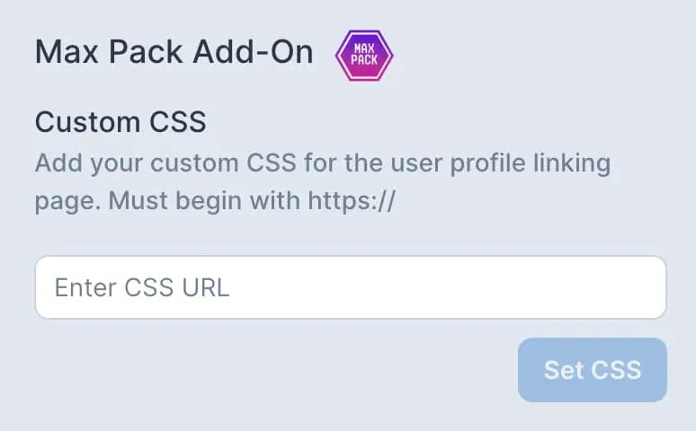
CSS Class Hooks
The page carries stable class names so your stylesheet has something to select: on the page itself, on the grid the cards are laid out in, and on each social network card. These names are a contract: a stylesheet written against them keeps working across dashboard releases, so you can safely build on them.Hosting your own stylesheet is available with the Max Pack
(and included with Enterprise). The Custom CSS field is read-only without it.
These class names apply to the white-labeled social linking page your users open,
not to your own dashboard.
.main-content and .social-linking-page-column are different elements, and the difference is what lets you widen the content without narrowing your background. The column carries the maximum width; the wrapper spans the full page. To run the cards wider than the default, set the width on the column:
Social network cards
Every card carries
.social-account-card plus exactly one of .connected-card or .unlinked-card, so the connected and unconnected states can be styled independently.
.social-account-icon is the square, not the logo drawn inside it. To resize a logo, size both — sizing only the square leaves the logo at its original size and it overflows:
.social-account-card is the natural place — and every badge on that card follows:
!important is needed here, because a custom property is not competing with a generated rule. Leaving them unset renders the default colors.
Warning badges — “Relink required”, “Reconnect”, “Identity check” — deliberately
ignore these properties and keep their own colors. They tell your user that an
account has stopped working and needs their attention, and a warning painted in
the same color as “Connected” reads as reassuring. Those badges have no selector
of their own for the same reason.
.main-content, and one of those levels has no class name of its own:
.connected-card instead of .unlinked-card and swaps the last two pieces: .click-to-link is replaced by the status badges, and a .social-account-avatar holding the connected account’s picture is added after the text column. So .click-to-link and .social-account-avatar never appear on the same card.
Select the named elements rather than the unnamed ones between them. The unnamed levels are not part of the contract and are the reason a rule that counts levels down from .main-content (.main-content > div, .main-content > div > div > div, .main-content > div:not(.additional-info)) lands a level or two off its target rather than on the grid or a card. See Updating an older stylesheet if your stylesheet has rules of that shape.
Style the card itself with .social-account-card, and reach for .social-accounts-grid or .social-account-card-wrapper when you want to change the layout rather than the card. See Change the Card Layout.
Change the order of the page
To move the whole blocks of the page around — for example to put the instruction block at the bottom — flatten the containers between the page column and the pieces you want to order, then order them:
display: contents removes a container from the layout while keeping its children, which is what puts your logo, the grid and the Close button on the same level so order can compare them. order only applies to items that are direct children of a flex container, so every wrapper in between has to be flattened — that is what the middle rule does.
The heading and the instruction block share one box, so they move together; hide the heading with .heading-social-accounts { display: none !important } if you only want the instruction block.
The two selectors in the middle rule are the one place on this page where you
still have to reach an element that has no name. They are anchored to named
elements one level up, so they are far more durable than counting down from
.main-content — but they are the rules to check first if a future release
changes how the page reorders..additional-info and .additional-info__body match the same element. They
were previously two nested elements, so if your stylesheet sets different values
for the same property on each, they now compete on one element and the more
specific rule wins instead of both applying. Combine them into a single rule.Linking Dialog Colors
The dialogs on the linking page — the unlink confirmation, the Facebook and LinkedIn page pickers, the Bluesky and X credential forms, and the Telegram activation code box — read ten custom properties. Set the ones you want and leave the rest out; anything you do not set keeps its default. Set them on:root or body, not on .social-account-card. Dialogs are rendered outside the page content, so a value set on a card or on .main-content never reaches them. This is the single most common reason a dialog rule appears to do nothing.
A complete dark example, with every property set:
!important is needed, because a custom property is not competing with a generated rule.
Keep
--ayr-dialog-fg and --ayr-dialog-muted-fg distinct. The title and the
secondary text default to different tones, and setting both to the same value
flattens the hierarchy. If you set only one, set --ayr-dialog-fg — a darkened
panel whose title does not follow it can leave the heading unreadable.The primary button’s label stays white, whatever you set
--ayr-dialog-accent
to. Pick an accent that white text reads on — a pale accent leaves the label
hard to read, and there is no separate property for it. The Cancel button next
to it follows --ayr-dialog-fg instead.If you darken
--ayr-dialog-bg, set --ayr-dialog-fg, --ayr-dialog-muted-fg
and --ayr-dialog-accent as well. The dialog panel is the only thing
--ayr-dialog-bg repaints — the dashboard stays in its light theme, so anything
still on a default color keeps a value picked for a white panel. The three
properties above carry the page-picker radio buttons and the disabled button
labels, which are the parts a dark panel leaves hardest to read.
--ayr-dialog-muted-fg falls back to --ayr-dialog-fg where it can, so setting
just those two is enough to get legible controls. Set --ayr-dialog-link too:
links keep their default color until you do, because that default is a strong
blue chosen for a white panel and it is the right color on one. Use a tone that
stays readable on your panel rather than reusing --ayr-dialog-accent — the
accent paints surfaces, a selected radio button and the primary button, which
are held to a lower contrast bar than text is.Updating an Older Stylesheet
If you wrote your stylesheet before the dashboard was rebuilt, some rules may no longer match. Rules built on the selectors documented above keep working. Rules built on anything else do not, and cannot be restored:-
The page’s own generated class names. Class names you may have copied out of browser developer tools (for example anything beginning with
chakra-) belong to the framework the page is built with, not to a public contract. Those class names no longer exist and there is no equivalent to swap in. Rewrite the rule against the selectors in the tables above. -
Bare element or attribute selectors such as
div > divorbutton[type="button"]. The page’s structure is not a contract and has changed, so a rule counting levels down from.main-contentnow lands on a different element than it did before. This is the most common reason a layout rule appears to do nothing, or does something unexpected. -
Positional rules that counted elements to reach the card grid. Before the grid and the cells had names, the only way to reach them was to count levels down from
.main-content, using rules shaped like.main-content > div,.main-content > div > div,.main-content > div > div > divor.main-content > div:not(.additional-info). Those rules still match something, which is why they are easy to miss:.main-contentis still there, but a card now sits five levels below it, so each rule lands a level or two off target. A rule aimed at the grid can end up on the wrapper holding the page header, and a rule aimed at one card can end up resizing every card at once. Replace them with the two names that now exist for this:.social-accounts-gridfor the grid, and.social-account-card-wrapperfor the cell holding one card. See Change the Card Layout. -
Rules that only work on a flex item:
z-index,order,align-self,flex. These are the hardest to spot, because the selector still matches and the declaration is still valid — it simply has no effect. On the older page your logo, heading, instruction block and Close button were direct children of.main-content, which your stylesheet made a flex container, so each of them was a flex item. A flex item honoursz-indexeven withoutposition, and honoursorderandalign-self. On the rebuilt page those four sit inside wrappers, so they are no longer flex items and all four properties stop applying to them. The symptom is usually something vanishing rather than moving. Az-indexon your logo, for example, is what used to lift it above a fixed header bar drawn with.main-content::before— without it the bar paints straight over the logo and the logo appears to be missing entirely, even though it loaded correctly and is the right size. Two fixes, either is fine: -
.linked-tag. The older page put this on the status badges of a connected card. It is not part of the contract above, deliberately: a connected card can now also show “Relink required” or “Identity check”, so a rule hiding.linked-tagwould hide a warning your user needs to act on. If your stylesheet hides.linked-tagand draws a replacement badge of its own, the replacement will not appear. Style.connected-carditself instead, and leave the status badges visible.
Target a Single Network
Use thedata-platform attribute rather than a position-based selector such as :nth-child. The networks available to your users can be filtered per account or per User Profile, which changes how many cards render and in what order. Position-based selectors break when that filter changes, and data-platform does not.
bluesky, facebook, gmb, instagramApi, linkedin, pinterest, reddit, snapchat, telegram, threads, tiktok, twitterByok, whatsapp, youtube
Two of these differ from the platform names you send to the API: on this page
Instagram is
instagramApi and X/Twitter is twitterByok.Change the Card Layout
By default the cards flow into a responsive grid: one column on a phone, two on a tablet, and three on a desktop. Two selectors control that layout, and which one you want depends on what you are changing:.social-accounts-gridis the grid itself. It is a flex row that wraps, and the space between cards is itsgap. Use it to change that spacing, or to replace the layout entirely..social-account-card-wrapperis the cell holding one card. Itswidthis what decides how many cards fit per row, and the page sets that width per screen size.
width set on .social-account-card (or on the unnamed wrapper between them) repaints the card inside a cell that has not moved, and the columns stay exactly where they were.
Neither of these is the card. To restyle a card’s border, background, or text, use .social-account-card as before.
To change only the space between cards:
!important also wins against the widths the page sets in its own screen-size rules:
If you have restricted the page to one or two
networks, the row does not fill its columns, and the page centers it for you. On
.social-accounts-grid it sets a width and a max-width that narrow the grid to
the cards it actually has, and align-self: center to center that narrower box,
with automatic side margins as a fallback. On each .social-account-card-wrapper
it sets a correspondingly wider width, so the cards keep the size they have in a
full row. All of this applies only at the screen sizes where the row is actually
short. With three or more networks the row is always full and none of it is set at
all. Your own rules override either element as normal, with !important, but note
that align-self is the declaration doing the centering: to align a short row
differently, override that as well as the widths.Example: Hide the Page Heading
The heading is an<h1> element, so a tag-qualified selector works if you prefer one:
Example: Restyle Unconnected Cards as Buttons
By default an unconnected card is a recessed grey surface with muted text, which some users read as unavailable rather than as something to click. The rules below turn every unconnected card into an outlined button in your brand color and leave connected cards untouched.The network logo on an unconnected card is intentionally desaturated and has no
selector of its own, so it stays greyscale on a colored background. Preview
your stylesheet on the linking page before
rolling it out to your users.
Change Page Title, Close Button, and Favicon
Set your own page title, close button, and favicon (.ico file).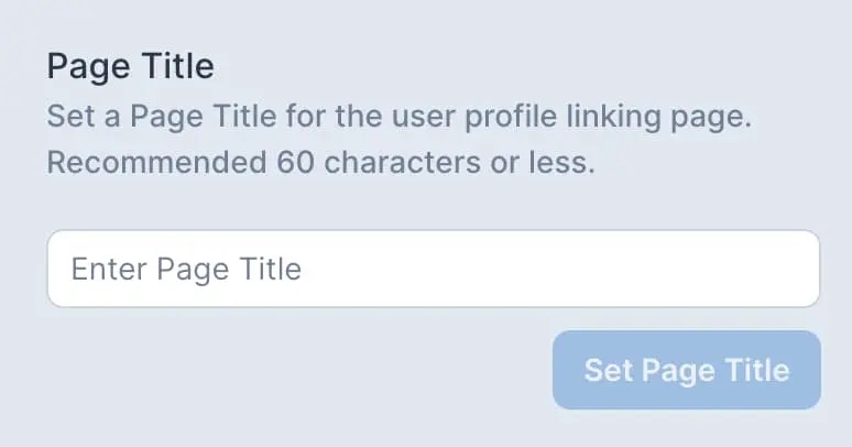
Footer Text
Customize the footer text and add copyright information on the social linking page. This allows you to display the footer text in different languages.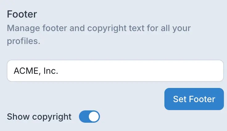
Enterprise Features
Max Pack
All the feature of Max Pack included with Enterprise.Automatically Resync Facebook and Instagram Pages
When security events occur on Facebook, such as password changes, all Facebook pages associated with that user account (including linked Instagram accounts) need to be reconnected to Ayrshare. For accounts managing numerous pages, this process can be time-consuming.- The “Resync” option is available when connecting Facebook or Instagram pages.
- By enabling this feature, all previously connected pages will be automatically relinked to the user profile.
- Note: Only previously linked pages will be reconnected; new pages will not be added automatically.
- This feature supports Facebook accounts with up to 400 pages.
- For accounts exceeding 400 pages, it’s recommended to distribute pages across multiple Facebook accounts.
- Best Practice: Only use the “Resync” option when necessary to reconnect all pages. For routine operations, it’s generally not required.